Friday, 31 March 2017


My final Product for my Double Page Spread is done, I've changed the bordered colour scheme to optimize the images and make them stand out more and also to follow my  colour scheme again like my front cover. i sorted  the issue of the apostrophe not being able to be added by using the full word which actually filled some dead space in the  pull quote box. i also tweaked the word layout in the top right of the picture so that  all the words fit perfectly onto their lines without being hyphened across.


After viewing my images, i decided i wanted to use all  of them to be able to show off my artist thoroughly, i used the 'nostalgic' image as my main article image displaying in the top right why the photo was taken and the significance of it. Due to the pictures being moved about, i chose  a new layout for my article, it now spreads under the photo and next to it with my pull quote sitting on the edge of the image which i had  inspiration from an issue of one of Q's magazines. The yellow compliments the black  text well and this helps it stand out, although my font style hasn't allowed for me to add an apostrophe which doesn't look very good so i will have to try and work a way around this issue without changing the font style as it is one i particularly like as it enhances the choice of style my magazine is. each photo is separated by a border to give the page a more organised look.


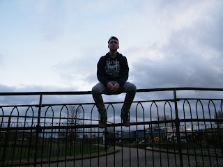
 i had a range of photos to use for my Double Page Spread article but the may need me to  change my design of how my article is placed in the pages themselves. This is down to how i want the image to  be viewed, i much  prefer the top image as it shows him in a sense of nostalgic past in his home town which is the type of image i want to have for my artist.


Only small changes have been made, adding the initials  of my artist to the back of my text just to add a sense of known to my artist like a signature stamp on the article, the text format of the header has changed  but not permanently  as it will go back to  the original on my final design.
I've added my magazine  logo for the reason of showing that its the magazine MusicNow! as well as adding the red colour scheme to the drop text and introduction text going with my main colour scheme of black and red. Ive also kept the design of having my text on the left allowing room for my image on the right.


 The start of my double page spread involved inserting my article and creating the header as well as my overall layout. I started with my article on the left to put my main image on the left but had yet to decide how i want my photo which may cause a change in my layout but i like how the article fits on the page. My heading  has highlighted Achiever to show the emphasis of achieving relating to  the struggle of my artist.


After total amendments i have reached my final product. I kept  everything the same but added the spotify and Apple Music logos to show what music apps support the magazine  and  promote them in the magazine. Overall the magazine cover is how i  would have hoped for it to turn out, the  text is clear and i managed to sort out the issue of lost text in the sub text. I added the white background to make the black text stand out.
After inserting the photo i was able to work around what i had and see what needed adjusting. i started by changing my sell lines completely, i re-imagined their colour  scheme  and font to make them stand out further and decided to keep the red seperators. the black jumper used has helped resolve the issue of losing the sub text but i still have a loss of text which will need to be sorted for my final product. One of the most successful parts of the cover is the "parental advisory" sticker which i've managed  to place in the hand of my artist to display that his lyrics are explicit adding meaning to his songs.


I needed to take some new photos for my front cover that had to fit with the design that i was going for. i had my artist prepare for them wearing the clothes i asked and with the props i needed, the photos turned out as well as planned and  allowed for me to use them creating the perfect image that i need
After consideration about my  main artist i decided to change him  to get a style that i think would work for my artist of choice and have a new approach to how they looked as a whole. During the waiting process to get my photos i changed my Header to look more appealing and pleasing, added a layout design to keep everything in form and created a logo. At the top i have also added additional features to make the magazine come to life and enhanced the  pug to make it stand out a bit more. at the bottom though i've run into the issue of loosing my text .


i've began to add the sell lines and try to tidy them up to allow them to stand out more. i chose the red dividers to make them a little more obvious to draw attention over to the sell lines them selves. The issue i have is that the colour scheme doesn't work entirely well, i need to find a new scheme that will stand out more.

Friday, 3 March 2017

My magazine cover is coming long but I have a few issues with my main image as, although he portrays the emotion of my artist it isn't as good as I want it to be, this means I need to retake a main image to get the perfect picture. My Splash is appealing and stands out with the opposite colours that i've used. I still need to add my pull quotes but they will go along the same style as the splash. My pug is also in need of a bit of redesigning as its pixelated and quite blurred.